ZIXEL CAD
Expert-grade analysis without the manual.
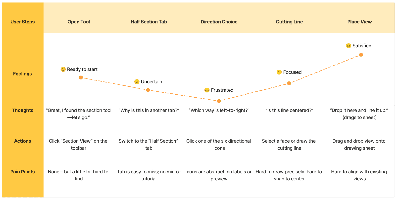
Two years as UX Designer at Zixel CAD, working across the platform. This study follows the three briefs I’d put on the table first: a ground-up redesign of the engineering drawing workflows, the UX for an expert-grade analysis tier, and the design system underneath everything. Each shipped with its own measured result.
See the benchmark Zixel CAD, Vancouver
By the numbers
Three briefs, each measured
Chapter 01 · The foundation
Thirty interviews, one finding
I joined as UX Designer in December 2024, alongside my MML role. Over two years the work ranged across the platform — more briefs than belong in one case study. This page follows the three that best show the range: rebuild the engineering drawing workflows, design a new expert-grade analysis tier, and build the design system underneath them. Before committing to any of them, I did the groundwork they would all stand on — roughly thirty user interviews and a hard benchmark of the field. One bar for everything that followed: an engineer opening the tool for the first time should produce correct work without reaching for documentation.
Research
Interviews, and a hard look at the field
I ran roughly 30 user interviews, mostly watching rather than asking. Where an engineer hesitated told me more than anything they said afterward, and hesitation almost always traced back to ambiguity: an unlabeled mode, a value with unclear units, a result with no visible cause.
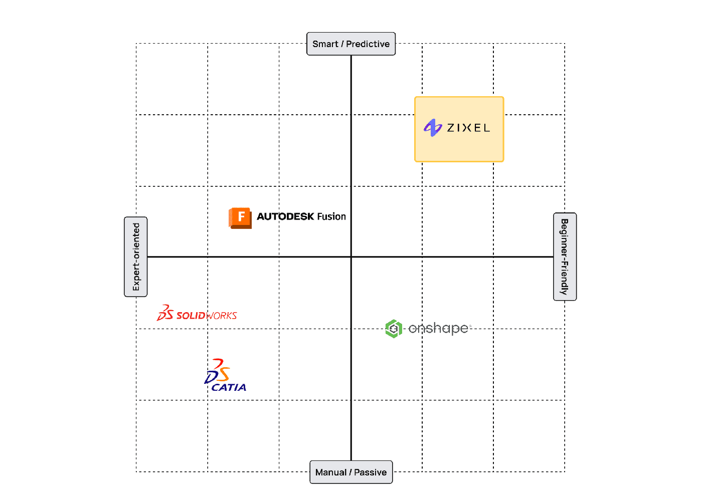
In parallel I benchmarked SolidWorks, Onshape, ZWCAD, and other major CAD platforms — never to copy, but to map the conventions engineers carry between tools:
- Honor the conventions that work; break the ones that exist only by habit.
- Pressure-test every decision against that competitive baseline.
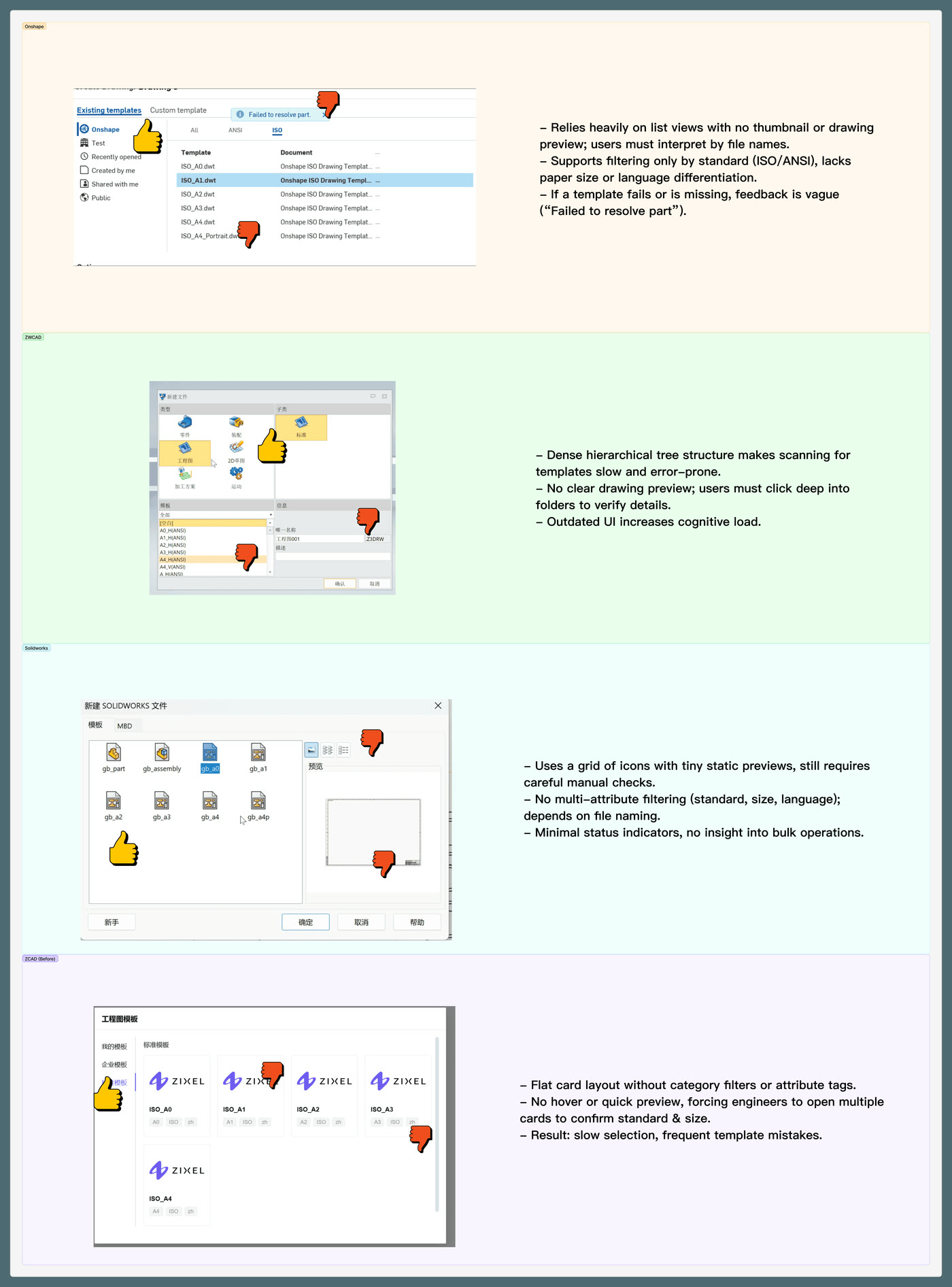
None of this happened solo — I pressure-tested directions with Zixel’s engineers and PM during the interview round, and kept them in the loop again through shipping, since they had to build and live with whatever the redesign committed to.
The core finding
Engineers don’t fear complexity — they fear not knowing what the software just did.
Chapter 02 · Brief one · Q4 2024
The drawing workflows, rebuilt from zero
Engineering drawings are how design intent reaches production, quality, and suppliers — and Zixel’s template module was slowing that handoff at the very first step. The evidence came from shadowing engineers and CAD admins across 15 manufacturing firms, a survey of 68 companies, and behavioral analytics inside the flow itself: picking a template took 35 seconds against a 15-second target, a quarter of selections were wrong, and satisfaction sat at 3.1 out of 5. The flat template list was the culprit — no filters, no previews, file names doing all the work, and a bulk import that left admins guessing.
The redesign
Every attribute visible, nothing to decode
The rebuild gave the library structure. Card sorting and tree tests set the categories — standard (ISO, GB, ANSI), paper size, language — and those became a filter system where file names used to do all the work. Template cards show every attribute up front, with notes editable inline. And bulk import got what admins actually needed: drag-and-drop with live progress, per-file success and failure states, and one-click retry — designed as much for the CAD admin managing hundreds of company templates as for the engineer picking one.
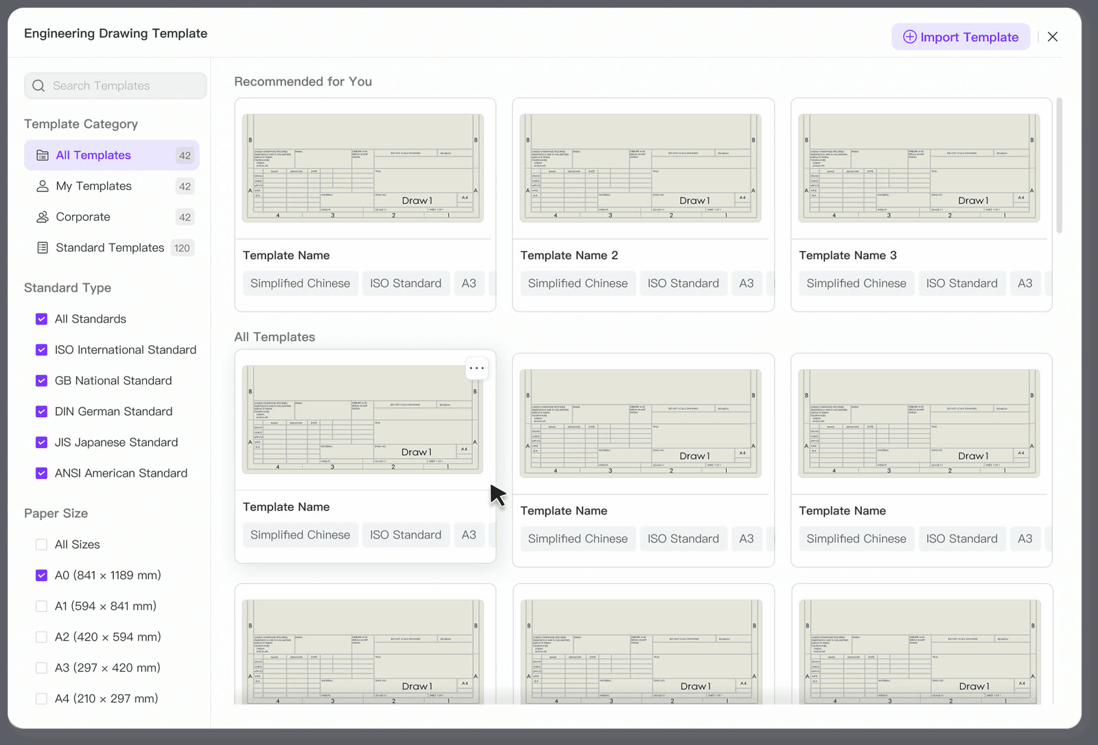
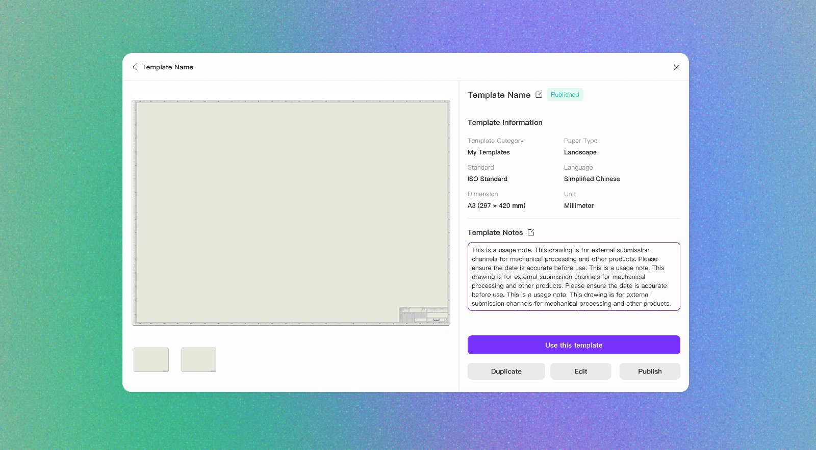
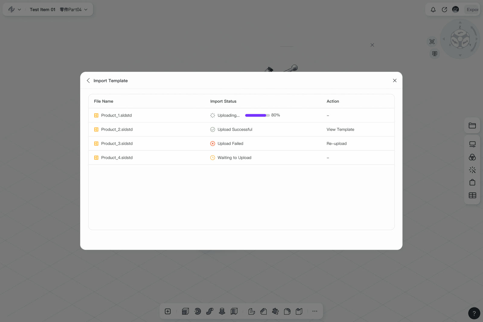
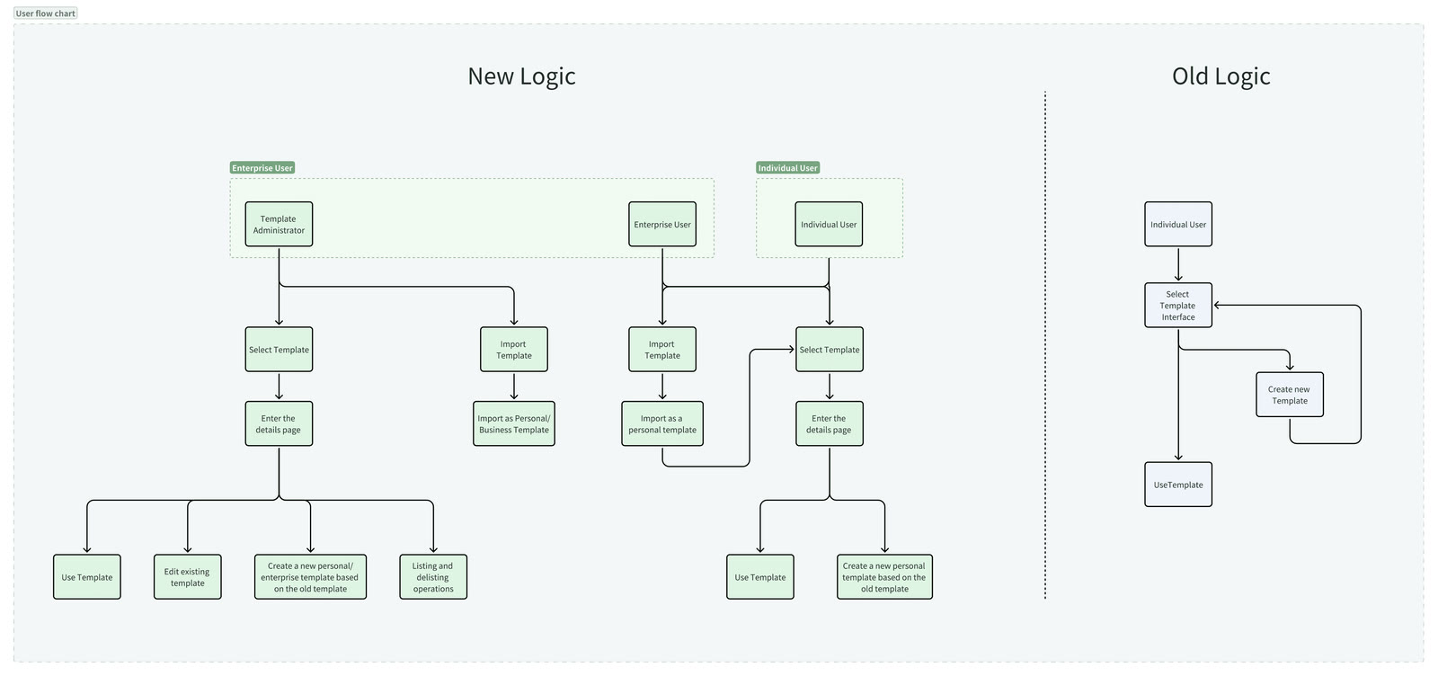
This is the brief the early study measured: onboarding time down 30% and task completion up 25%, on a new user’s first hour with the tool.
Chapter 03 · Brief two · Q2 2025
The analysis tier: draw the line, skip the dialog
Brief two was a new class of expert-grade features: surface curvature maps, wall thickness analysis, and 2D and 3D section views. Traditional section workflows demand pixel-perfect snapping, rigid step sequences, and a grasp of geometric constraints before anything appears on screen — and one wrong click restarts the whole process. As one engineer put it in research: “I can’t tell if I’m doing it right until it’s too late.”
The features
What if you could just draw the cutting line?
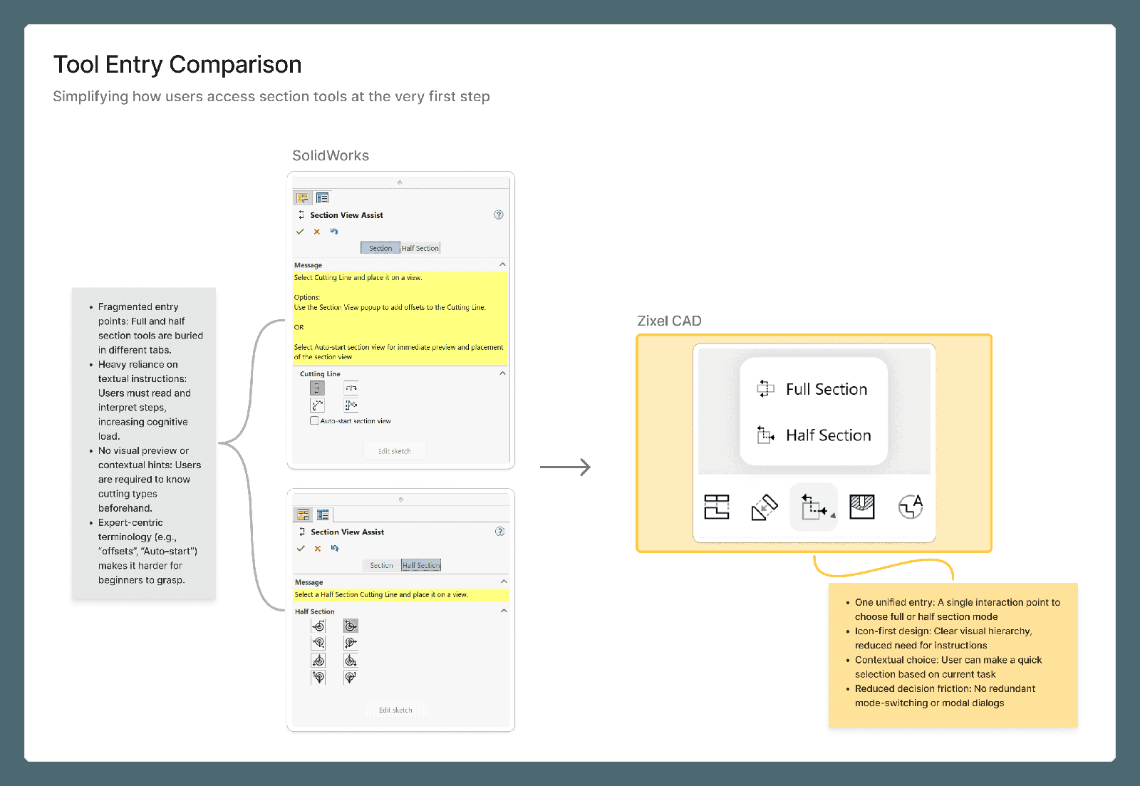
SolidWorks makes the cost visible: full and half sections live in separate tabs behind instructional text, and a half section means choosing from eight fixed cutting directions before the system shows any feedback — a decision that assumes you already understand the geometry’s symmetry. The redesign started from a simpler question: what if you could just draw the cutting line, the way you drag the Pen Tool in Figma?
So that became the design. Draw a line across the geometry, freely — the system reads its direction and symmetry, infers full or half, snaps for you, and previews the cut in real time, with undo rather than restart as the recovery path. Five steps — menu, mode, eight directions, exact snap, confirm — collapsed into one gesture: click the tool, draw the line, accept the live preview.
The qualitative feedback from testing explained why it worked: progressive feedback built confidence at every step, constraints arrived late enough to keep the flow natural, and small cues — the guide line changing color as the system read the geometry — made the inference legible instead of magical.
Wall thickness and curvature follow the same grammar: analysis reads as color on geometry, not tables. Learn one feature and you have learned them all.
Results
What the benchmark measured
An instrumented usability benchmark on the redesigned section workflow, measuring an expert mid-task: task time down 57.6%, undo actions down 69.2%, and self-reported satisfaction up 105%.
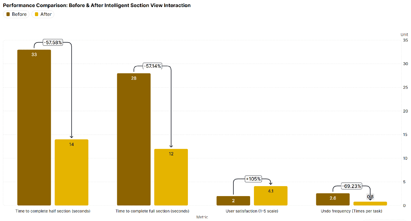
Method note: benchmark sessions ran with 10 beginner and 5 intermediate users, instrumented on the redesigned section workflow. It covers brief two only — brief one’s onboarding numbers come from the earlier, separately run study in the pitch above.
Chapter 04 · Brief three
The design system underneath
The third brief ran under the other two the whole time: I built and maintained the design system used across the platform’s modules. In software this dense, consistency is not polish — it is how the product teaches itself. When panels, inputs, and states behave identically everywhere, each workflow an engineer learns lowers the cost of the next one.
Maintaining it was as much editorial work as visual work: a small component set, documented patterns, and every one-off exception inside a module treated as a bug to resolve, not a precedent to follow.
The honest part