If your tool needs a manual, that was a decision
Whether someone has to read a manual before they can use your software isn't a fact about how complex the software is. It's a decision — usually made by omission. I learned to see it watching mechanical engineers hesitate inside tools they use every single day.
Expert tools outsource comprehension by default
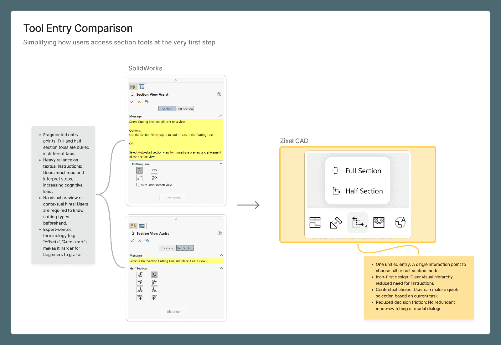
Professional software carries an old assumption: real power requires a training course first. CAD is the clearest case I've worked in — the capability is genuinely there, but you're expected to already know where everything lives and what each setting does before the tool becomes useful. The manual, or six months on the job, does work the interface should be doing.
That's the default posture of most expert software: ship the full capability, then write documentation to bridge the gap. It feels like the responsible choice — nothing hidden, nothing dumbed down. It's also a decision, made by omission, to spend the user's time instead of the design's.
The hesitation tells you more than the answer
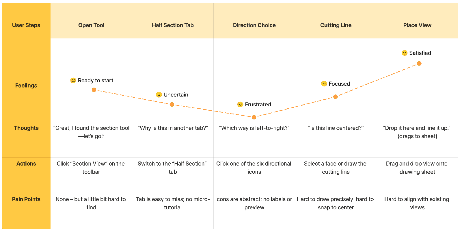
Most of what I believe about this came from watching, not asking. Put an engineer in front of an analysis task and where they hesitate tells you more than anything they say afterward — and the hesitation almost always traces to the same root: an unlabeled mode, a value with unclear units, a result with no visible cause.
The observation that reframed how I design: engineers don't fear complexity — they fear not knowing what the software just did. In dozens of sessions, nobody ever asked for a simpler tool. They asked, in effect, for a tool that told the truth about its own state.
Defaults first, parameters after
The conventional order for a power feature is a setup dialog that assumes you already know the answer you're looking for. I now invert it on principle: a legible first result from sensible defaults, rendered where the work is, with parameters available after — not before. Analysis reads as color on geometry instead of tables; a section view is drawn by direct manipulation instead of form-filling. Learn one feature and you've mostly learned them all, because they share a grammar.
That's progressive disclosure aimed at the specific fear the sessions surfaced: don't hide the power — just don't demand a decision before there's enough visible information to make it well.
Engineers don't fear complexity — they fear not knowing what the software just did.
Consistency is how a product teaches itself
None of this holds without a design system enforcing it everywhere at once. I keep the component set deliberately small and treat every one-off exception as a bug to resolve, not a precedent to follow. In dense software, consistency isn't polish — it's pedagogy. When panels, inputs, and states behave identically everywhere, each workflow someone learns lowers the cost of the next one, and the manual gets shorter without anyone deciding to write less.
The alternative I keep cutting
The honest alternative is always there: expose every setting up front and write a manual to explain it. I cut that path deliberately, and I try to notice when I'm drifting back toward it — a growing pile of documentation is usually the interface confessing.
What doesn't move: people with years of muscle memory in other tools still have to relearn some default behaviors, and that cost is real. I can't design it away — only make it as small and as legible as I can.
How you know it worked
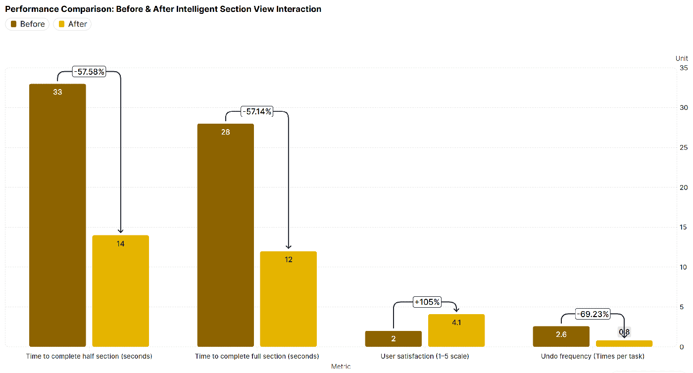
The test of a defaults-first redesign isn't applause — it's whether measured work moves: task time, undo counts, how often someone reaches for help. When I've measured before and after on the same tasks, with people who do this work for a living, the numbers have moved the way the hesitation maps said they would — for new users in their first hour and for experts mid-task alike. The specifics live in the Zixel CAD case study →; the transferable part is the posture. Whether your users need a manual was never a fact about your software.