Background
The original engineering drawing template management interface relied on a flat tab structure and offered only basic browsing capabilities. As the system scaled, users faced growing friction: cumbersome navigation, lack of batch operations, inconsistent visuals, and no easy way to quickly perform frequent actions. Both new and advanced users found the workflow inefficient and confusing.
Goals
Clarify information hierarchy: Shift from a tab-based, flat structure to a layered, sidebar + modal-based navigation
Enable efficient workflows: Support batch operations, quick template actions, and contextual interactions
Modernize the visual system: Establish a consistent color palette, component library, and responsive layout
Enhance usability and feedback: Reduce user confusion, provide instant feedback, and support error recovery
Improve onboarding: Lower the learning curve for new users, while meeting the needs of expert users
User Pain Points
Fragmented Navigation:
Important functions and template types were split across equal-level tabs, with no clear distinction between frequently used and advanced features.
Inefficient Actions:
Users could only browse templates from the main view. All meaningful actions (edit, duplicate, delete, preview) required navigating into individual detail pages, making workflows slow and tedious.
No Batch Operations:
Bulk management was not supported, forcing users to repeat manual actions for each template.
Low Visual Clarity:
Excessive whitespace, poor information grouping, and lack of hierarchy resulted in scattered attention and slower task completion.
Limited Feedback & Guidance:
The system lacked clear states, notifications, and feedback on success/error, increasing user uncertainty and error rates.
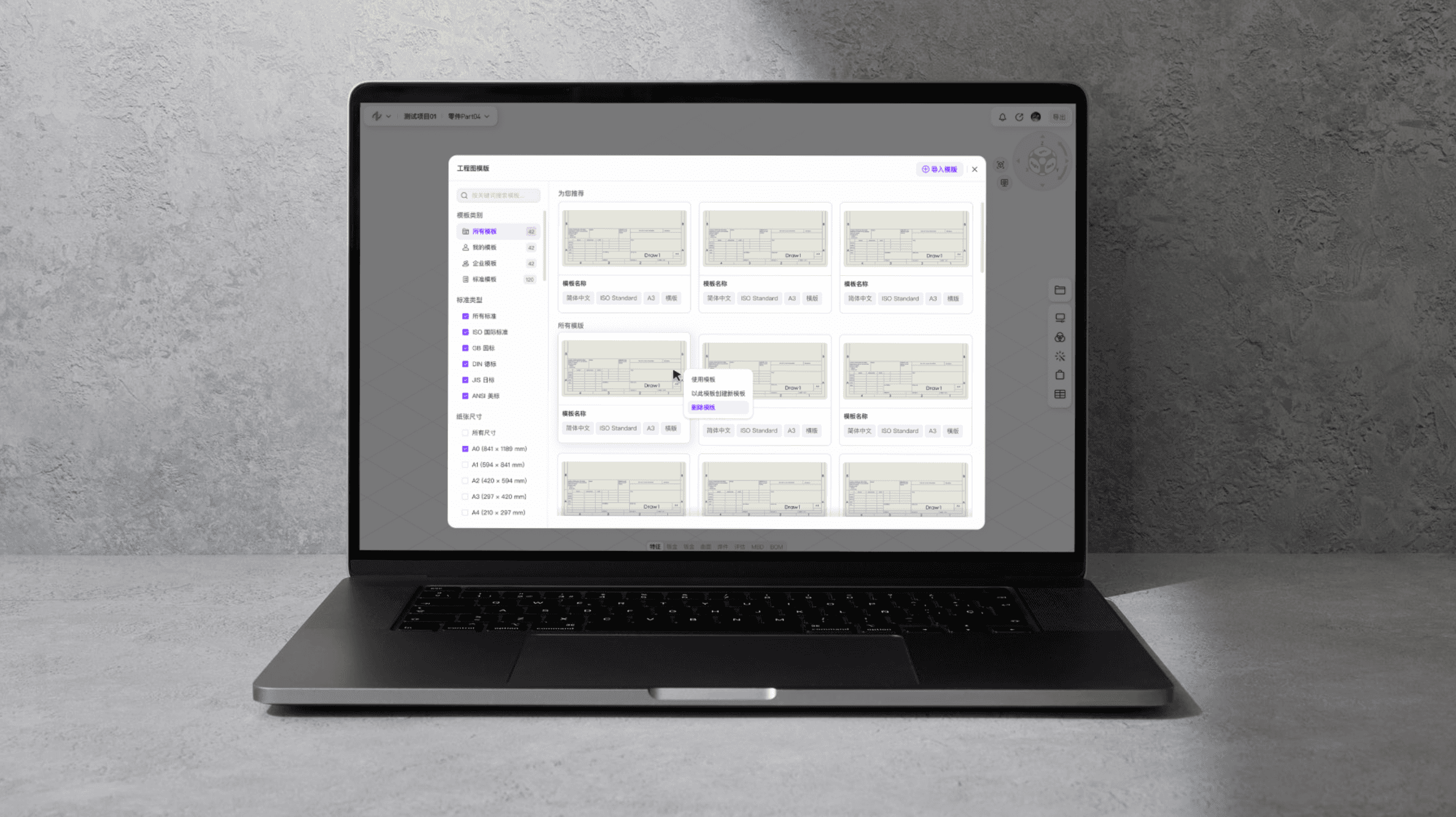
Old Interface: Audit & Problems
Key Issues:
All template categories (personal, corporate, standard) were presented as equal tabs, obscuring priority tasks
Template cards only showed basic info (name and tags), with no shortcut actions
No support for batch selection or quick filtering
Significant white space without functional grouping
No in-context feedback or action confirmations
The New Design: Solutions & Flow
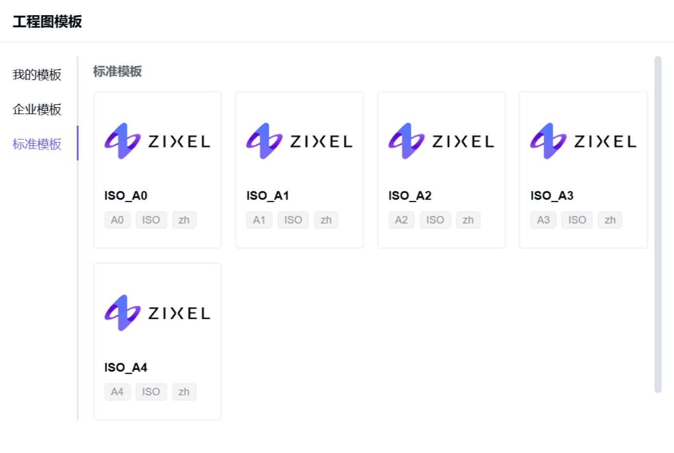
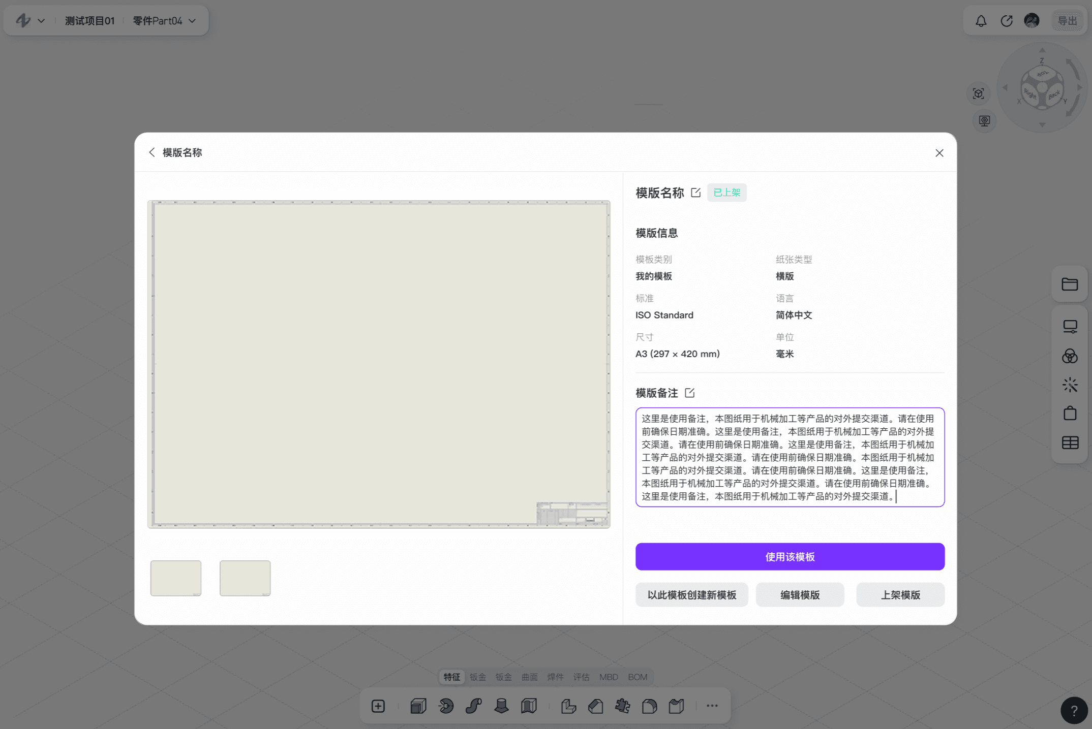
1. Information Architecture
Introduced a sidebar hierarchy (primary: category; secondary: template list)
Used modal dialogs for secondary operations, keeping the main workspace uncluttered
Tags and badges visually reinforce grouping and context

2. Efficient Operations
Card hover actions: Preview, edit, duplicate, and delete can be triggered directly from the main list
Search and filter: Added quick filters and keyword search for large template libraries

3. Streamlined Workflow
Example flows:
Browse & Filter: Quickly navigate categories, filter by type or tag, locate templates instantly
Quick Action: Hover over a template card to edit, preview, or duplicate without leaving the main page
Edit in Context: All edit actions open as modals, preserving the user's position and mental model
4. Visual System Upgrade
Unified color palette and button styles
Clearer spacing, grouping, and layout grid
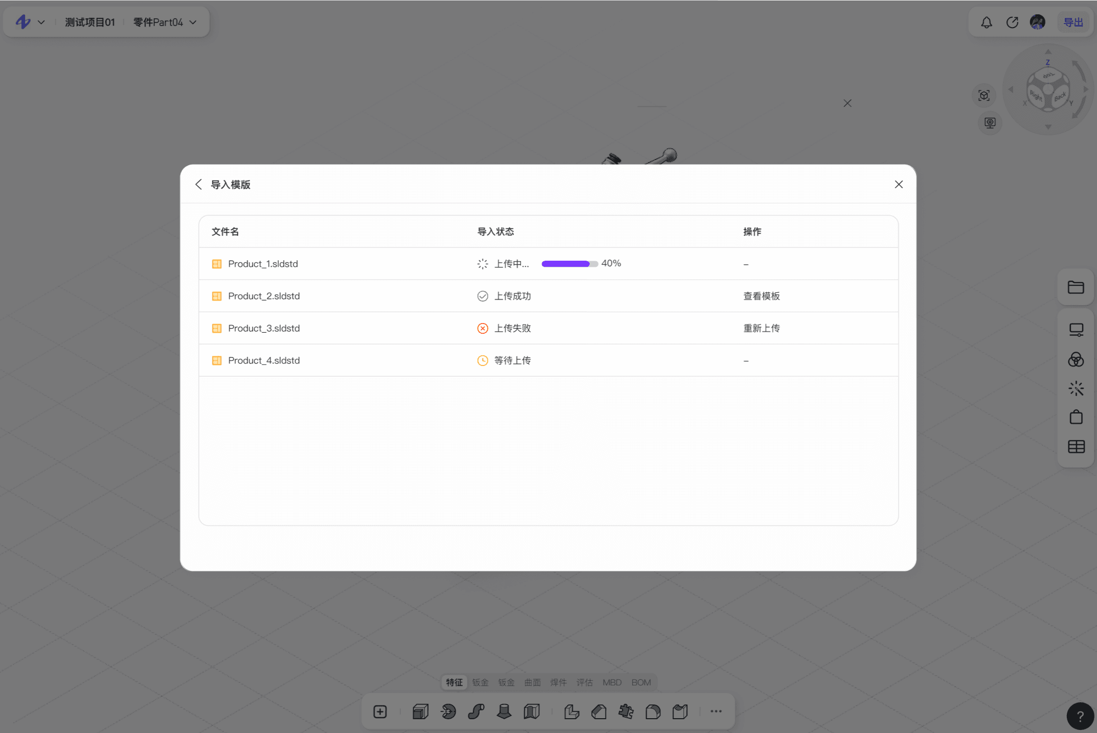
Highlighted feedback for actions (success, error, loading)
Usability Validation
Internal reviews and user tests showed a significant reduction in time needed for routine tasks
New users reported a smoother learning curve due to clearer structure and feedback
Power users highlighted batch operations and quick actions as key time-savers
Visual refresh increased perception of product professionalism and trust
Results & Takeaways
This redesign project delivered:
A clear, scalable information architecture
Major workflow efficiency gains for both new and advanced users
A consistent, maintainable visual system
A robust foundation for future extensibility (e.g., permissions, advanced filters, mobile adaptation)

